Homework 2

Climate change and temperature anomalies
If we wanted to study climate change, we can find data on the Combined Land-Surface Air and Sea-Surface Water Temperature Anomalies in the Northern Hemisphere at NASA’s Goddard Institute for Space Studies. The tabular data of temperature anomalies can be found here
To define temperature anomalies you need to have a reference, or base, period which NASA clearly states that it is the period between 1951-1980.
weather <-
  read_csv("https://data.giss.nasa.gov/gistemp/tabledata_v4/NH.Ts+dSST.csv",
           skip = 1,
           na = "***")
For each month and year, the dataframe shows the deviation of temperature from the normal (expected).
You have two objectives in this section:
Select the year and the twelve month variables from the
weatherdataset. We do not need the others (J-D, D-N, DJF, etc.) for this assignment. Hint: useselect()function.Convert the dataframe from wide to ‘long’ format. Hint: use
gather()orpivot_longer()function. Name the new dataframe astidyweather, name the variable containing the name of the month asmonth, and the temperature deviation values asdelta.
tidyweather <- weather %>%
  select(1:13) %>%
  pivot_longer(
    cols = 2:13,
    names_to = "Month",
    values_to = "delta")

tidyweather
## # A tibble: 1,716 × 3
## Year Month delta
## <dbl> <chr> <dbl>
## 1 1880 Jan -0.36
## 2 1880 Feb -0.5
## 3 1880 Mar -0.23
## 4 1880 Apr -0.29
## 5 1880 May -0.06
## 6 1880 Jun -0.16
## 7 1880 Jul -0.17
## 8 1880 Aug -0.25
## 9 1880 Sep -0.22
## 10 1880 Oct -0.3
## # … with 1,706 more rowsPlotting Information
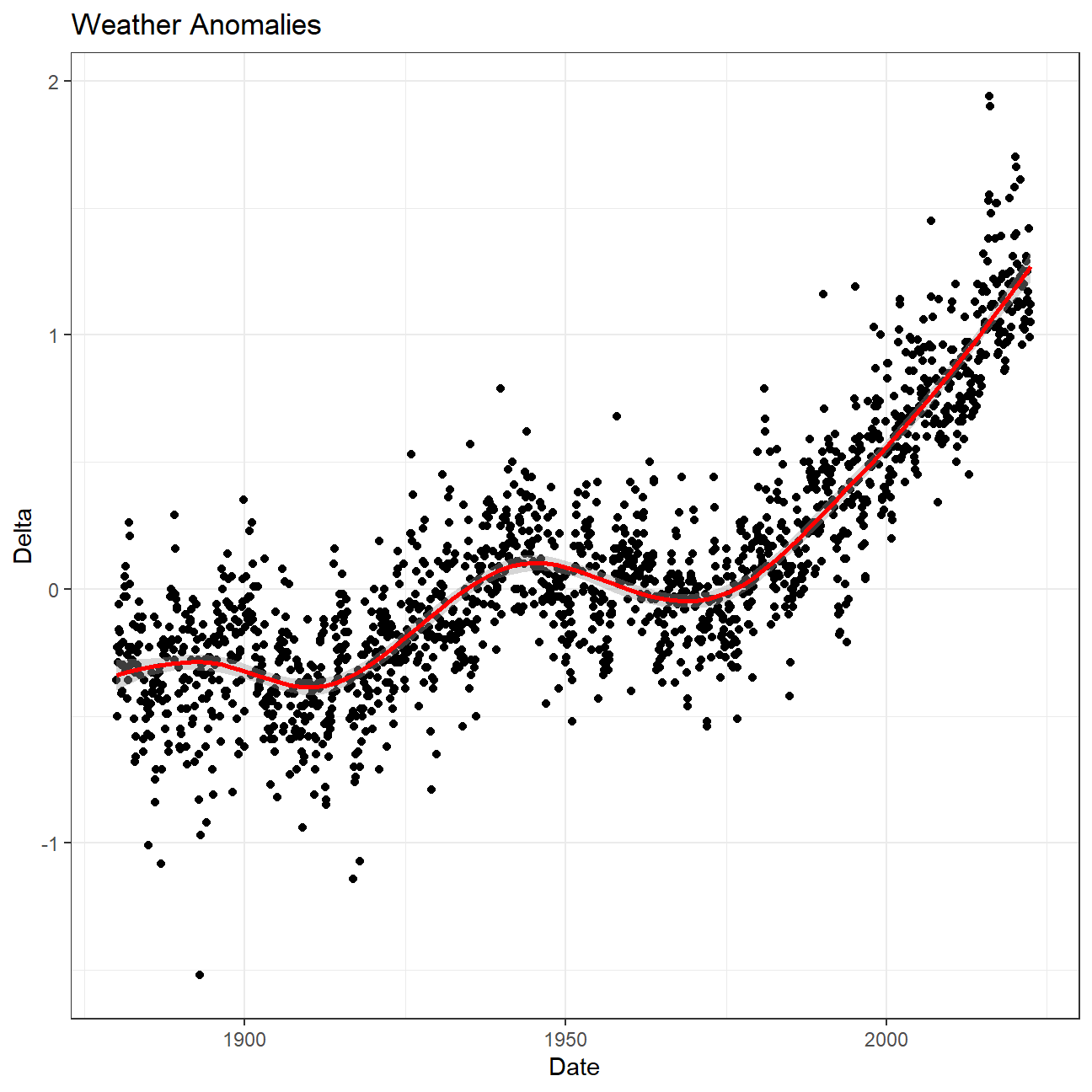
Let us plot the data using a time-series scatter plot, and add a
trendline. To do that, we first need to create a new variable called
date in order to ensure that the delta values are plot
chronologically.
tidyweather <- tidyweather %>%
  mutate(date = ymd(paste(as.character(Year), Month, "1")),
         month = month(date, label=TRUE),
         year = year(date))

ggplot(tidyweather, aes(x=date, y = delta))+
  geom_point()+
  geom_smooth(color="red") + #plot the trend line
  theme_bw() +
  labs (
    title = "Weather Anomalies",
    x = "Date",
    y = "Delta"
  )
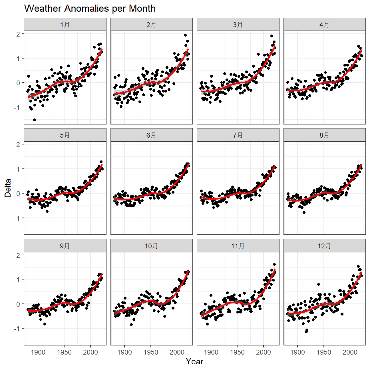
Is the effect of increasing temperature more pronounced in some months?
- The above graph shows a clear seasonal affect over the years. However, if we look at the graph below, it shows the deviation per month have very similar trend lines, reflective of the above graph.
ggplot(tidyweather, aes(x=date, y = delta))+
  geom_point()+
  geom_smooth(color="red") +
  facet_wrap(~month) + #analyse over a each month
  theme_bw() +
  labs (
    title = "Weather Anomalies per Month",
    x = "Year",
    y = "Delta"
  )
It is sometimes useful to group data into different time periods to
study historical data. For example, we often refer to decades such as
1970s, 1980s, 1990s etc. to refer to a period of time. NASA calcuialtes
a temperature anomaly, as difference form the base periof of 1951-1980.
The code below creates a new data frame called comparison that groups
data in five time periods: 1881-1920, 1921-1950, 1951-1980, 1981-2010
and 2011-present.
comparison <- tidyweather %>%
  filter(Year>= 1881) %>%     #remove years prior to 1881
  #create new variable 'interval', and assign values based on criteria below:
  mutate(interval = case_when(
    Year %in% c(1881:1920) ~ "1881-1920",
    Year %in% c(1921:1950) ~ "1921-1950",
    Year %in% c(1951:1980) ~ "1951-1980",
    Year %in% c(1981:2010) ~ "1981-2010",
    TRUE ~ "2011-present"
  ))
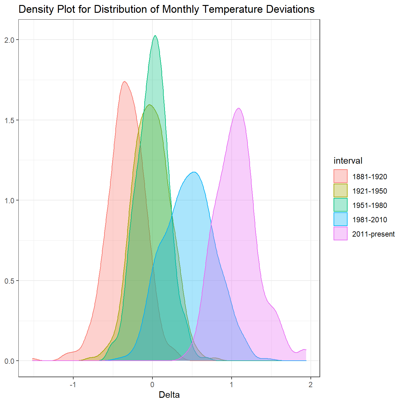
Now that we have the interval variable, we can create a density plot
to study the distribution of monthly deviations (delta), grouped by
the different time periods we are interested in.
comparison %>%
  group_by(interval) %>%
  ggplot(aes(
    delta,
    fill = interval, #fill color by the different intervals
    color = interval)) +
  geom_density(alpha=1/3) +
  theme_bw() +
  labs(
    title = "Density Plot for Distribution of Monthly Temperature Deviations",
    x = "Delta",
    y = NULL
  )
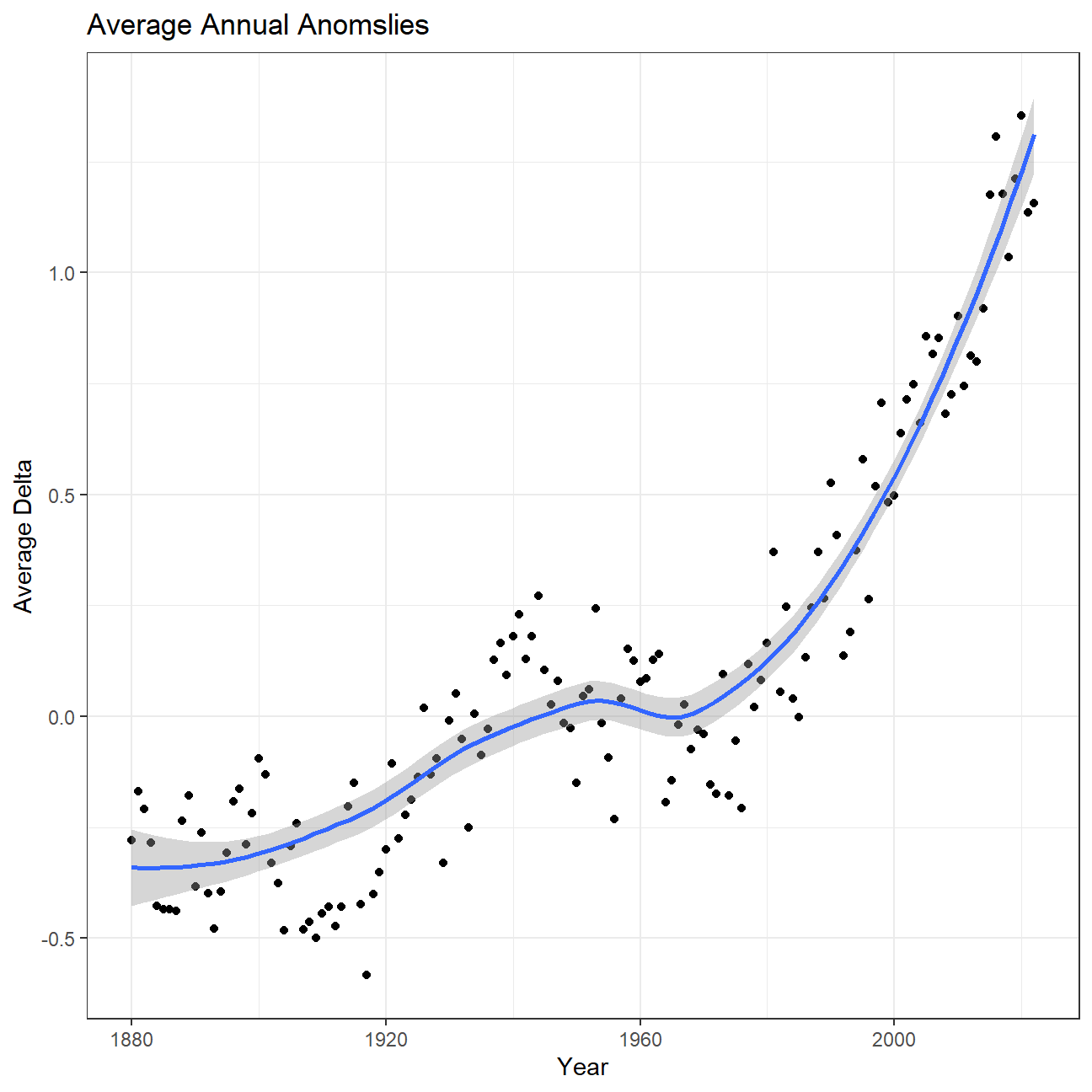
So far, we have been working with monthly anomalies. However, we might be interested in average annual anomalies.
#creating yearly averages
average_annual_anomaly <- tidyweather %>%
  group_by(Year) %>%   #grouping data by Year

  # creating summaries for mean delta
  # use `na.rm=TRUE` to eliminate NA (not available) values
  summarise(mean_delta = mean(delta, na.rm = TRUE))

#plotting the data:
ggplot(average_annual_anomaly,
       aes(x = Year,
           y = mean_delta)) +
  geom_point() +
  #Fit the best fit line, using LOESS method
  geom_smooth(method = "loess", se = TRUE) +
  #change theme to theme_bw() to have white background + black frame around plot
  theme_bw() +
  labs(
    title = "Average Annual Anomslies",
    x = "Year",
    y = "Average Delta"
  )
Confidence Interval for delta
NASA points out on their website that
A one-degree global change is significant because it takes a vast amount of heat to warm all the oceans, atmosphere, and land by that much. In the past, a one- to two-degree drop was all it took to plunge the Earth into the Little Ice Age.
Your task is to construct a confidence interval for the average annual
delta since 2011, both using a formula and using a bootstrap simulation
with the infer package. Recall that the dataframe comparison has
already grouped temperature anomalies according to time intervals; we
are only interested in what is happening between 2011-present.
formula_ci <- comparison %>%

  # choose the interval 2011-present
  filter(interval=="2011-present") %>%
  # calculate summary statistics for temperature deviation (delta)
  summarise(
    # calculate mean, SD, count, SE, lower/upper 95% CI
    mean_delta = mean(delta, na.rm = TRUE),
    sd_delta = sd(delta, na.rm = TRUE),
    count = n(),
    t_critical = qt(0.975, count-1),
    se_delta = sd_delta/sqrt(count),
    moe = t_critical*se_delta,
    delta_lower = mean_delta - moe,
    delta_upper = mean_delta + moe
  )

#print out formula_CI
formula_ci
## # A tibble: 1 × 8
## mean_delta sd_delta count t_critical se_delta moe delta_lower delta_upper
## <dbl> <dbl> <int> <dbl> <dbl> <dbl> <dbl> <dbl>
## 1 1.07 0.266 144 1.98 0.0222 0.0438 1.02 1.11library(infer)
set.seed(1234)
ci_bootstrap <- comparison %>%
filter(interval=="2011-present") %>% # choose the interval 2011-present
infer::specify(response = delta) %>%
infer::generate(reps = 1000, type = "bootstrap") %>%
infer::calculate(stat = "mean")
ci_percentile <- ci_bootstrap %>%
infer::get_confidence_interval(level = .95, type = "percentile")
ci_percentile## # A tibble: 1 × 2
## lower_ci upper_ci
## <dbl> <dbl>
## 1 1.02 1.11What is the data showing us? Please type your answer after (and outside!) this blockquote. You have to explain what you have done, and the interpretation of the result. One paragraph max, please!
We used two methods: the formula and the bootstrap method, to calculate the confidence interval of the delta which is N(1.02,1.11). This tells us that with the given mean and sd, we are 95% certain that the true mean delta falls between 1.02 and 1.11.
Biden’s Approval Margins
As we saw in class, fivethirtyeight.com has detailed data on all polls that track the president’s approval
approval_polllist <- read_csv('https://projects.fivethirtyeight.com/biden-approval-data/approval_polllist.csv')

# Use `lubridate` to fix dates, as they are given as characters.
approval_polllist <- approval_polllist %>%
  mutate(
    modeldate = mdy(modeldate),
    startdate = mdy(startdate),
    enddate = mdy(enddate),
    createddate = mdy(createddate)
  )

glimpse(approval_polllist)
## Rows: 4,522
## Columns: 22
## $ president <chr> "Joe Biden", "Joe Biden", "Joe Biden", "Joe Biden"…
## $ subgroup <chr> "All polls", "All polls", "All polls", "All polls"…
## $ modeldate <date> 2022-09-13, 2022-09-13, 2022-09-13, 2022-09-13, 2…
## $ startdate <date> 2021-01-19, 2021-01-19, 2021-01-20, 2021-01-20, 2…
## $ enddate <date> 2021-01-21, 2021-01-21, 2021-01-21, 2021-01-22, 2…
## $ pollster <chr> "Morning Consult", "Rasmussen Reports/Pulse Opinio…
## $ grade <chr> "B", "B", "B-", "B", "B", "B+", "B+", "B-", "B", "…
## $ samplesize <dbl> 15000, 1500, 1115, 15000, 1993, 1516, 941, 1200, 1…
## $ population <chr> "a", "lv", "a", "a", "rv", "a", "rv", "rv", "a", "…
## $ weight <dbl> 0.2594, 0.3382, 1.1014, 0.2333, 0.0930, 1.2454, 1.…
## $ influence <dbl> 0, 0, 0, 0, 0, 0, 0, 0, 0, 0, 0, 0, 0, 0, 0, 0, 0,…
## $ approve <dbl> 50.0, 48.0, 55.5, 51.0, 56.0, 45.0, 63.0, 58.0, 52…
## $ disapprove <dbl> 28.0, 45.0, 31.6, 28.0, 31.0, 28.0, 37.0, 32.0, 29…
## $ adjusted_approve <dbl> 49.4, 49.2, 54.6, 50.4, 55.4, 46.1, 59.5, 57.5, 51…
## $ adjusted_disapprove <dbl> 30.9, 40.3, 32.5, 30.9, 33.9, 29.0, 38.4, 32.8, 31…
## $ multiversions <chr> NA, NA, NA, NA, NA, NA, NA, NA, NA, NA, NA, NA, NA…
## $ tracking <lgl> TRUE, TRUE, NA, TRUE, NA, NA, NA, NA, TRUE, TRUE, …
## $ url <chr> "https://morningconsult.com/form/global-leader-app…
## $ poll_id <dbl> 74272, 74247, 74248, 74273, 74246, 74327, 74256, 7…
## $ question_id <dbl> 139491, 139395, 139404, 139492, 139394, 139570, 13…
## $ createddate <date> 2021-01-28, 2021-01-22, 2021-01-22, 2021-01-28, 2…
## $ timestamp <chr> "10:03:31 13 Sep 2022", "10:03:31 13 Sep 2022", "1…Create a plot
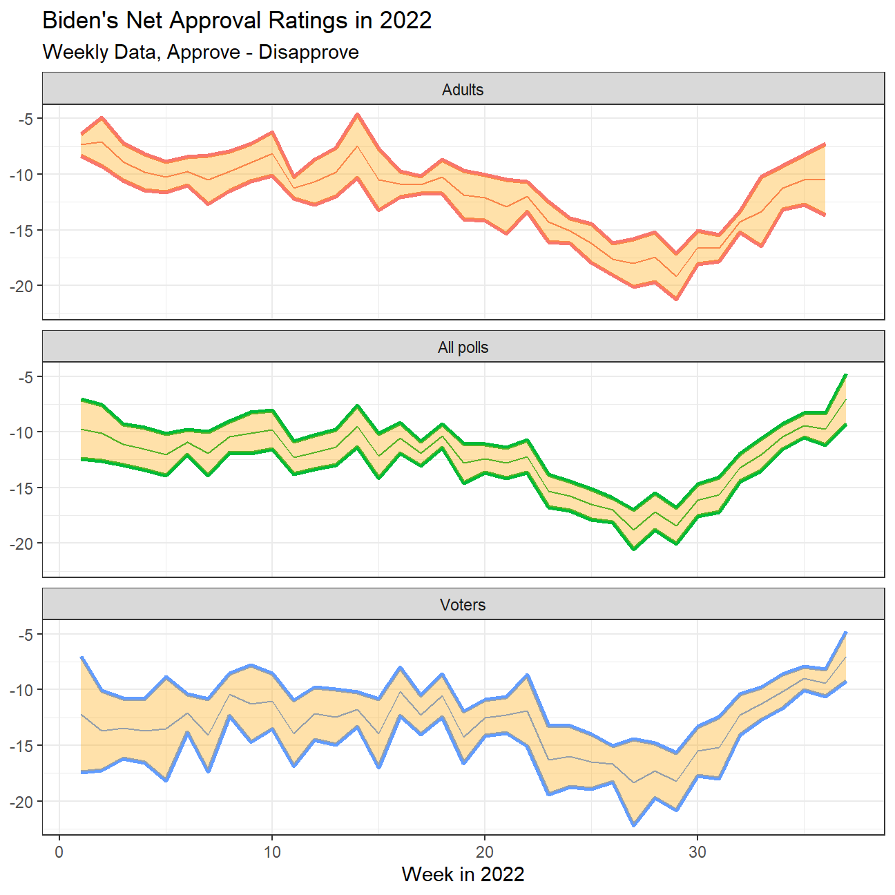
What I would like you to do is to calculate the average net approval
rate (approve- disapprove) for each week since he got into office. I
want you plot the net approval for each week in 2022, along with its 95%
confidence interval. There are various dates given for each poll, please
use enddate, i.e., the date the poll ended.
approval_polllist %>%
  filter(year(enddate) == 2022) %>% #filtering for year 2022
  mutate(Week = week(enddate)) %>% #calculating week number
  group_by(subgroup, Week) %>%
  mutate(rating = approve - disapprove) %>% #calculating net approval rate

  #create confidence interval at 95% confidence
  summarise(
    mean_rating = mean(rating, na.rm = TRUE),
    sd_rating = sd(rating, na.rm = TRUE),
    count = n(),
    t_critical = qt(.975,count-1),
    se_rating = sd_rating/sqrt(count),
    moe = t_critical * se_rating,
    rating_low = mean_rating - moe,
    rating_high = mean_rating + moe
  ) %>%

  # plot the graph
  ggplot(aes(x=Week, color = subgroup, fill = subgroup)) +
  geom_line(aes(y=rating_low), size = 1.2) +
  geom_line(aes(y=rating_high), size = 1.2) +
  geom_line(aes(y=mean_rating)) +
  facet_wrap(~subgroup, ncol = 1) +
  #to fill the area between the confidence interval lines
  geom_ribbon(aes(
    ymin = rating_low,
    ymax = rating_high
  ),fill = "orange", alpha = 1/3) +
  theme_bw() +
  theme(legend.position = "none") +

  #format the plot
  labs(
    title = "Biden's Net Approval Ratings in 2022",
    subtitle = "Weekly Data, Approve - Disapprove",
    x = "Week in 2022",
    y = NULL
  )
Challenge 1: Excess rentals in TfL bike sharing
Recall the TfL data on how many bikes were hired every single day. We can get the latest data by running the following
url <- "https://data.london.gov.uk/download/number-bicycle-hires/ac29363e-e0cb-47cc-a97a-e216d900a6b0/tfl-daily-cycle-hires.xlsx"

# Download TFL data to temporary file
httr::GET(url, write_disk(bike.temp <- tempfile(fileext = ".xlsx")))
## Response [https://airdrive-secure.s3-eu-west-1.amazonaws.com/london/dataset/number-bicycle-hires/2022-09-06T12%3A41%3A48/tfl-daily-cycle-hires.xlsx?X-Amz-Algorithm=AWS4-HMAC-SHA256&X-Amz-Credential=AKIAJJDIMAIVZJDICKHA%2F20220913%2Feu-west-1%2Fs3%2Faws4_request&X-Amz-Date=20220913T163233Z&X-Amz-Expires=300&X-Amz-Signature=006e9b2d32bb12874068ae6c2c34fed60f671ca9cb11a22e142e1af06a177e2c&X-Amz-SignedHeaders=host]
## Date: 2022-09-13 16:32
## Status: 200
## Content-Type: application/vnd.openxmlformats-officedocument.spreadsheetml.sheet
## Size: 180 kB
## <ON DISK> C:\Users\tinytot\AppData\Local\Temp\RtmpwFD6NR\file524c72f81863.xlsx# Use read_excel to read it as dataframe
bike0 <- read_excel(bike.temp,
sheet = "Data",
range = cell_cols("A:B"))
# change dates to get year, month, and week
bike <- bike0 %>%
clean_names() %>%
rename (bikes_hired = number_of_bicycle_hires) %>%
mutate (year = year(day),
month = lubridate::month(day, label = TRUE),
week = isoweek(day))We can easily create a facet grid that plots bikes hired by month and year since 2015.
#create facet_grid
bike %>%
  filter(year > 2014) %>%
  ggplot(aes(bikes_hired)) +
  geom_density() +
  facet_grid(vars(year),vars(month)) +
  theme_bw() +
  labs(
    title = "Distribution of Bikes Hired per month since 2015",
    x = "Distribution of Bikes Hired",
    y = NULL
  ) +
  theme(axis.text.y=element_blank(),
        axis.ticks.y=element_blank())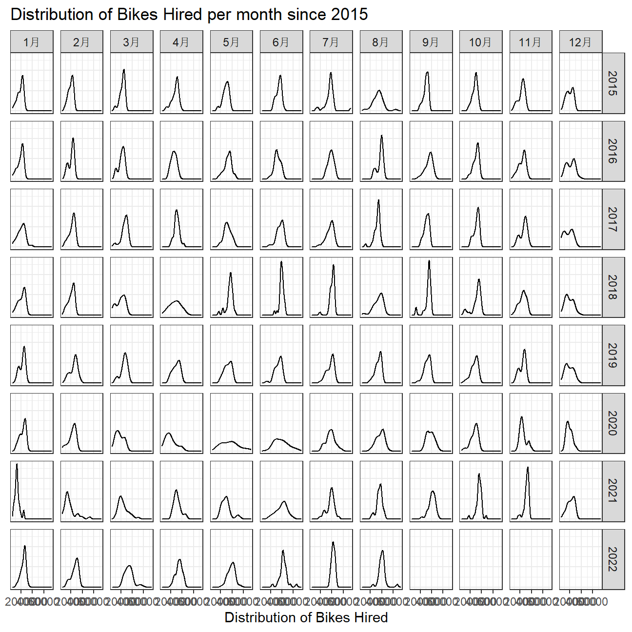
However, the challenge I want you to work on is to reproduce the following two graphs.
# calculate expected bikes hired using 2016-2019
expected <- bike %>%
  filter(year >= 2016 & year <=2019) %>%
  group_by(month) %>%
  mutate(expected_monthly = mean(bikes_hired)) %>%
  select(expected_monthly, month)

# calculate actual monthly average of bikes
actual <- bike %>%
  filter(year >= 2017) %>%
  group_by(year, month) %>%
  mutate(actual_monthly = mean(bikes_hired))

# combined the two dfs
final <- left_join(actual, expected, by = 'month') %>%
  mutate(diff = actual_monthly - expected_monthly)

final %>%
  ggplot(aes(x=month, month = 1)) +
    geom_line(aes(y = expected_monthly, group =1), color="#0096FF", size = 1.5) +
    geom_line(aes(y = actual_monthly, group = 1)) +
  # geom_ribbon to add green
    geom_ribbon(aes(
      ymax = expected_monthly,
      ymin = pmin(diff, 0) + expected_monthly),
      fill = "#C70039",
      alpha = 0.4,
      group = 1) +
  # geom_ribbon to add red
    geom_ribbon(aes(
      ymax = actual_monthly,
      ymin = actual_monthly - pmax(diff,0)),
      fill = "#007500",
      alpha = 0.4,
      group = 1) +
  # facet by year
    facet_wrap(~year)+
    labs(title = "Month changes in TfL bike rentals",
         subtitle = "Change from monthly average shown in blue and calculated between 2016-2019",
         caption = "Source: TfL, London Data Store",
         x = "Months",
         y = "Bike rentals")+
    theme_bw()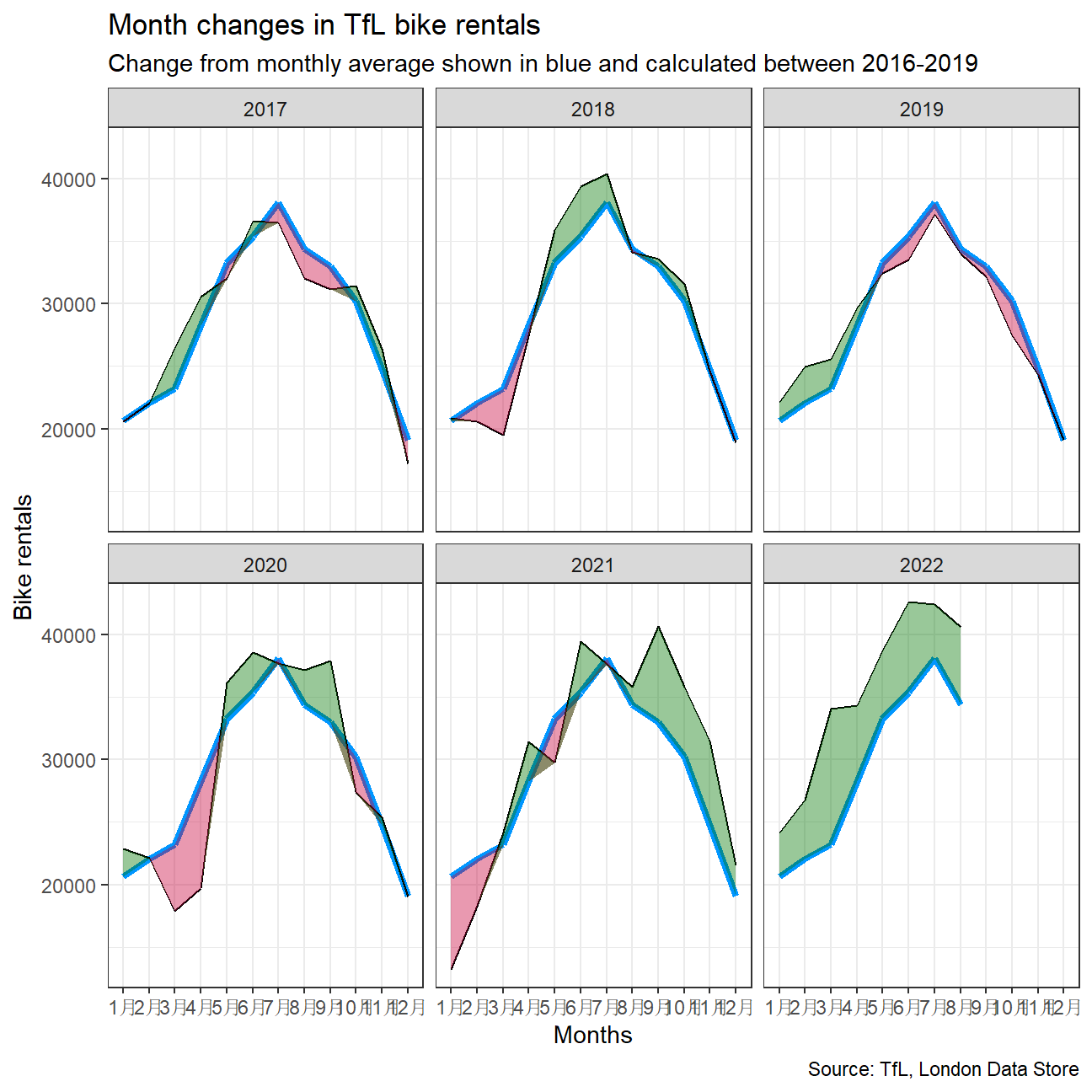
The second one looks at percentage changes from the expected level of weekly rentals. The two grey shaded rectangles correspond to Q2 (weeks 14-26) and Q4 (weeks 40-52).
#calculate actual bikes hired
bike_week1 <- bike %>%
  filter(year > 2016) %>%
  group_by(year, week) %>%
  mutate(mean_bikes = mean(bikes_hired))

#calculate expected hired bikes
bike_week2 <- bike %>%
  filter(year >=2016, year <= 2019) %>%
  group_by(week) %>%
  mutate(expected_hired = mean(bikes_hired))

# join the two tables and calculate percent_change
bikes_week <- bike_week1 %>%
  full_join(bike_week2, by="week") %>%
  mutate(
    pct_change = (mean_bikes - expected_hired)/expected_hired,
    color_id = pct_change > 0)

#create plot
ggplot(bikes_week,
       aes(x = week)) +
  annotate("rect",fill ="grey",alpha = 0.5,xmin = 14,xmax = 26, ymin =-Inf,ymax =Inf) +
  annotate("rect",fill ="grey",alpha = 0.5,xmin = 40,xmax = 52, ymin =-Inf,ymax =Inf) +
  geom_line(aes(y = pct_change)) +
  facet_wrap(~year.x) +

  #fill the pct_change under 0%
  geom_ribbon(
    aes(ymin = 0,
        ymax = pmax(0,pct_change),
        fill = "red"),
    alpha = .4) +

  #fill the pct_change over 0%
  geom_ribbon(
    aes(ymin = pmin(0, pct_change),
        ymax = 0,
        fill = "green"),
    alpha = .4) +

  #create geom_rug()
  geom_rug(aes(color=color_id),sides = "b") +


  #format the plot
  labs(
    title = "Weekly changes in TfL bike rentals",
    subtitle = "% changes from weekly averages calculated between 2016-2019",
    x = "Week",
    y = NULL
  ) +
  theme_bw() +
  theme(legend.position = "none")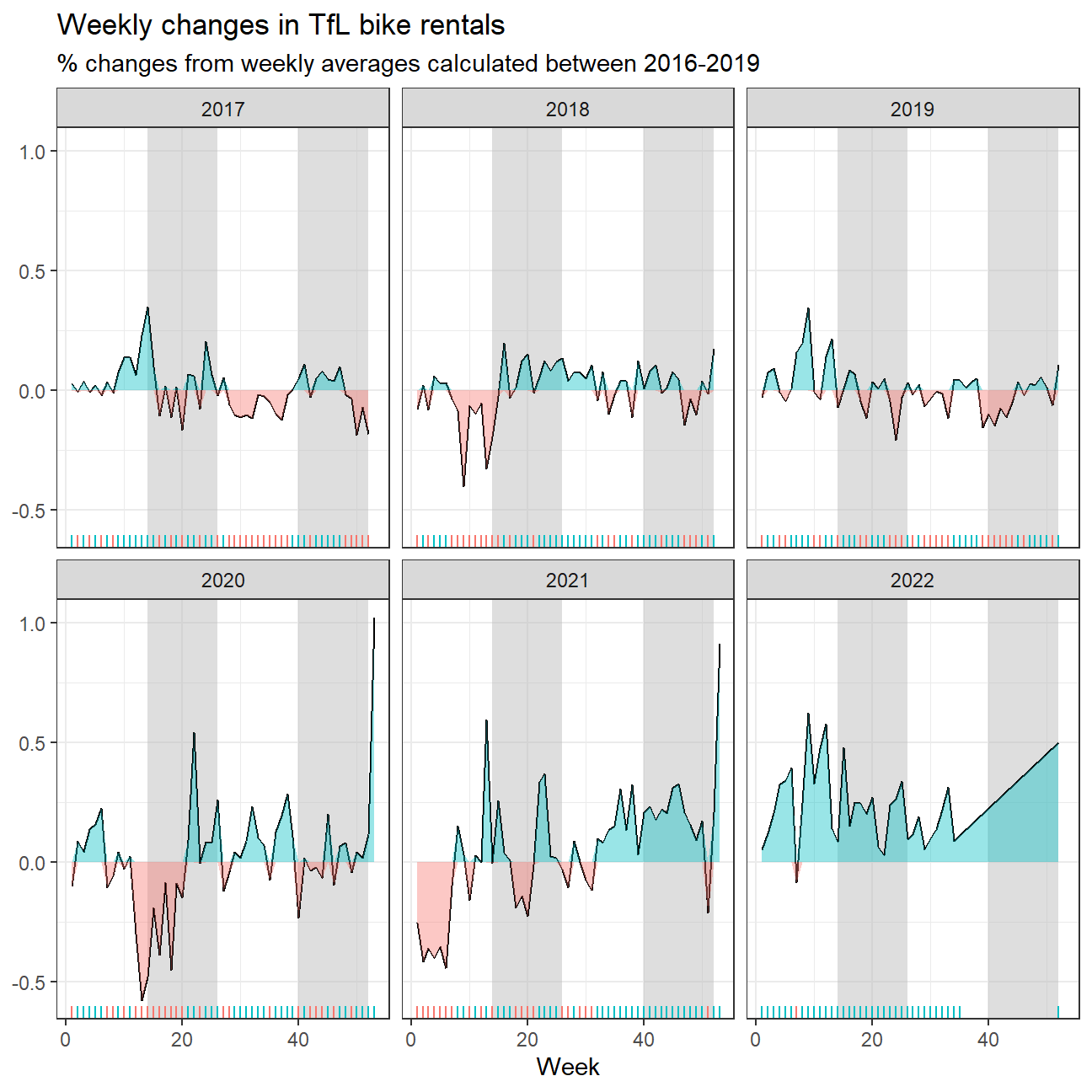
Should you use the mean or the median to calculate your expected rentals? Why?
- We decided to use mean, because the data showed seasonal trends and there were not many clear outliers, which would affect the data.
Details
- Who did you collaborate with: Group 6 - Sonakshi Gupta, Jean Francois Peters, Wybe Harms, Drishti Goyal, Suzy Wang, Zezhou Tang
- Approximately how much time did you spend on this problem set: 6 hrs 20 min 33 seconds
- What, if anything, gave you the most trouble: Creating coloured ribbons for the graphs
